Playfield art for the hobbit released

Metalzoic

New member
Jun 8, 2012
907
0
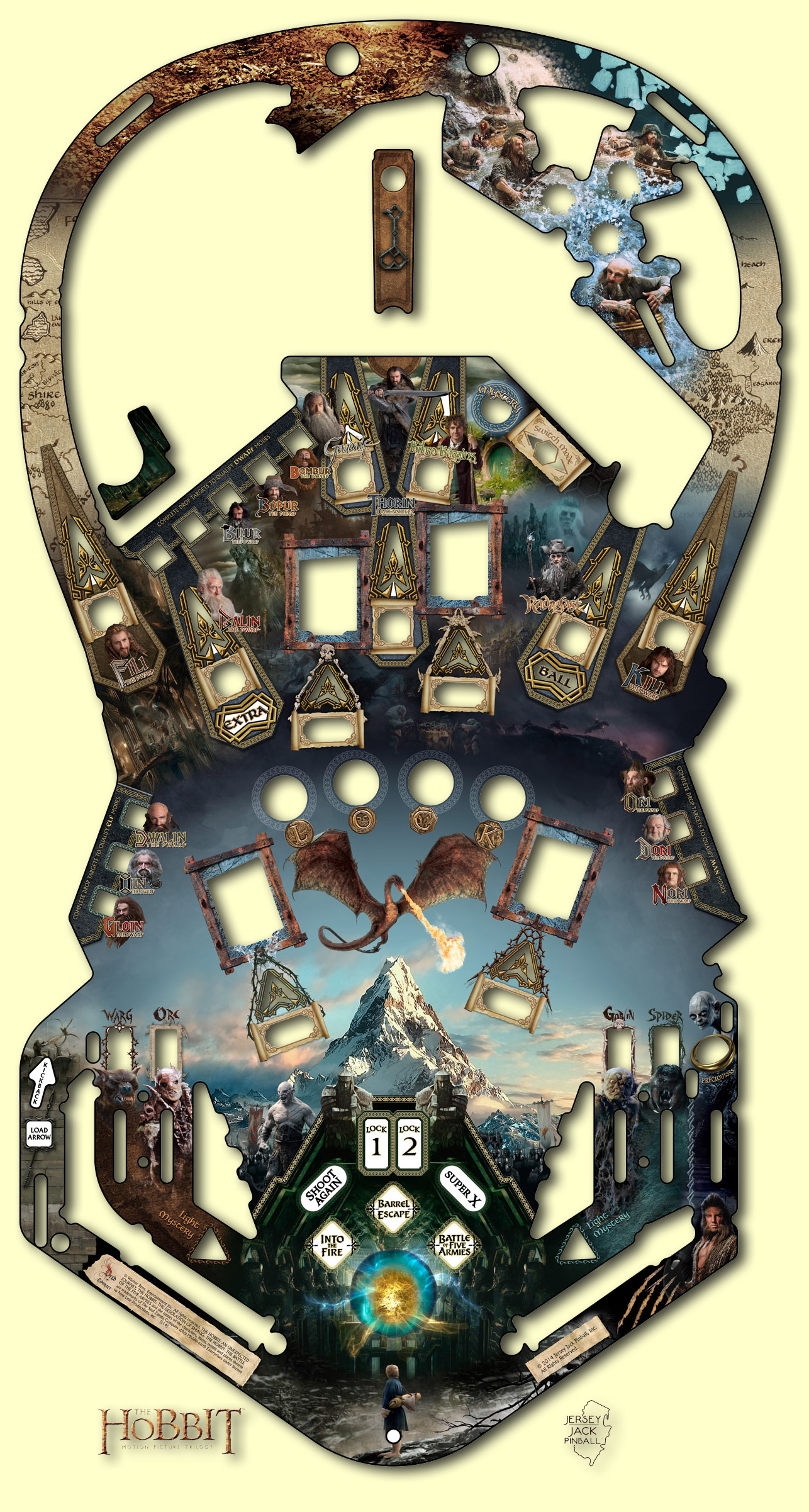
They showed it a couple days ago for the first time. Also the new playfield schematic.
I am curious what your thoughts are on this artwork before I give my impression as someone that bought one.


http://www.pinballnews.com/games/hobbit/index10.html

35.jpg
 

Kolchak357

Senior Pigeon
May 31, 2012
8,102
2
I saw a lot of people ripping on it on Pinside. My favorite one asked why the Paramount mountain logo was on the pin. They also complained about the L and K letters touching the dragon wings. Apparently this is a big no no in the art world. They also didn't like the "floating heads".
I think it's hard to tell until you see a completed table with all the inserts, light, ramps, and toys in place. I don't hate it, but it was hoping for a little more. And there are a lot of little heads on there.
 

Metalzoic

New member
Jun 8, 2012
907
0
I can't believe I typo'd the title like that... oops.:eek:

I think it is horrendous. It's more like a mock-up of how not to design a Hobbit pin. It looks like a hastily thrown together clip-art, photoshop job done by somebody that isn't even capable of lining up artwork or text and doesn't care if it's good or not.

Every shot is named after a character. None of the movies named weapons, scenes, locations, adventures, book chapters are used at all.
Even the Elf and Man shots have pictures of Dwarf heads instead of the Elf or Human characters.
One of the shots doesn't have anything at all, it's just blank.
A couple of the Dwarves have the wrong names.

It basically looks like they gave no thought for composition, no care for the theme, apparently no knowledge of the movies, no attempt to match shots/names to even match the rules.

I'll save my real ranting for Pinside or the JJP owners forums, but after paying several thousand and waiting a year and 1/2 for the art reveal this is quite a kick in the nuts.
 

canuck

New member
Nov 28, 2012
880
1
IMO that dragon with the mountain looks horribly tacky. I agree with what some on pin side have said, it would have been preferable to go with hand drawn graphics instead of photoshopping assets from the movie posters. For example, the dragon will already feature prominently as a large animated figurine, there's no need to plaster it right I. The middle of the board. They could have used that space to depict the journey on the map, or entering the cave ect...

---

while LOTR uses assets from the movie posters, at leas the graphics are in proportion while also integrating together with a map theme - so it works as depicting the journey theme. In the hobbit, the dragon is too small for the space, it is out of proportion...a basic design error. If they insist on using the dragon, they should zoom in on its head and eyes, meanacingly spouting fire.
 
Last edited:

karl

New member
May 10, 2012
1,809
0
It's no beauty queen, that's for sure. Still looks better than the movie playfields from Stern.

With a few corrections (like removing the dwarfs or putting them all under the bumpers ;) ) it could be pretty good. I like the colors, at least. I knew it would be photoshop clips a plenty, just from the theme and dealing with a movie studio so I am not that worked up about it. It Would be nice to have elves, and men for the elves and men targets though. I do not understand why they have put dwarfs on those targets at all. At least put a circle around their heads.

On the positive side, Keefer is on pinside and is open to suggestions. (as long as they are doable at this point in the process) Far more than you can say about Stern.

I also agree that it will probably look a lot better with the toys and lights. Still really looking forward to the day when I get this pin. More so than any other pins I have ordered .
 

dtown8532

New member
Apr 10, 2012
1,685
0
Oh man, I can't wait to see Pat's game...oh wait, that's not this one. Whoops. :p.

Seriously, I am still looking forward to the finished product.
 

Espy

New member
Sep 9, 2013
2,098
1
One thing I think is good is they removed one of the upper flippers. No idea why there were two there in the first place. It just seems like they put upper flippers on because "upper flippers are cool". It doesn't look like there is a single shot you need the flippers for. But with only one it's more acceptable, even if there are still no shots that require them.

P.S. There is an overlay of the blueprint on the artwork here, so you can get a pretty good idea of how the full thing is laid out: http://www.pinballnews.com/games/hobbit/index10.html
 

Metalzoic

New member
Jun 8, 2012
907
0
One thing I think is good is they removed one of the upper flippers. No idea why there were two there in the first place. It just seems like they put upper flippers on because "upper flippers are cool". It doesn't look like there is a single shot you need the flippers for. But with only one it's more acceptable, even if there are still no shots that require them.

P.S. There is an overlay of the blueprint on the artwork here, so you can get a pretty good idea of how the full thing is laid out: http://www.pinballnews.com/games/hobbit/index10.html

Upper right flipper looks like it's for the arrow shot. I launches from the lower left arrow lane and you control the power of the shot to get it to the upper right flipper. Time that shot to bat it to the upper left Smaug toy. Either to a the little drop target cave there or possibly to hit some part of the Smaug toy itself that we haven't seen yet.
 

mpad

New member
Jan 26, 2014
1,398
0
Night and day. So much better. Other looked somehow like someone discovering photoshop.
 

Metalzoic

New member
Jun 8, 2012
907
0
Yeah. I'm really excited about the new art and all the new plastics. It also got better sculpts for the orc and goblin pop-up bash targets and a new shot into the pops. And according to Jacks email quite a few more things still to be added and finalized.
I can't wait!
 

DanBradford

New member
Apr 5, 2013
648
0
It's not all an improvement though, is it?

Why is there a traffic speed camera now on the left next to the chicken head?

And surely that horrible LCD 'book' with its garish chunky frame isn't supposed to look as crappy as that?

I look forward to the finished game and hope it's not as slow and boring as WOZ turned out to be.
 

canuck

New member
Nov 28, 2012
880
1
It's not all an improvement though, is it?

Why is there a traffic speed camera now on the left next to the chicken head?

And surely that horrible LCD 'book' with its garish chunky frame isn't supposed to look as crappy as that?


IMO an OLED screen with greater viewing angles may have made more sense... of course, LCD are brighter. A trade-off. Still better than old-style monopoly miniscreen from yesteryear. :D
 

Members online

No members online now.

Members online

No members online now.
Top