- Feb 22, 2012
- 4,158
- 1
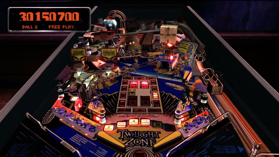
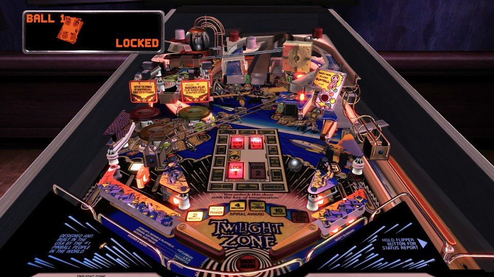
Don't read too much into the way the table looks in the pics above. The screen caps are obviously washed out a bit and are a bit blurry with obvious compression. If you don't believe me, just go back and take a look at the table in action in the "making of TZ" video.
↑ "MAKING OF" VIDEO SCREEN CAP ↑
↑ FARSIGHT FACEBOOK SCREEN CAP ↑
↑ "MAKING OF" VIDEO SCREEN CAP ↑
↑ FARSIGHT FACEBOOK SCREEN CAP ↑
Last edited:
")


