Flipperdeflip
New member
- Feb 17, 2015
- 175
- 0
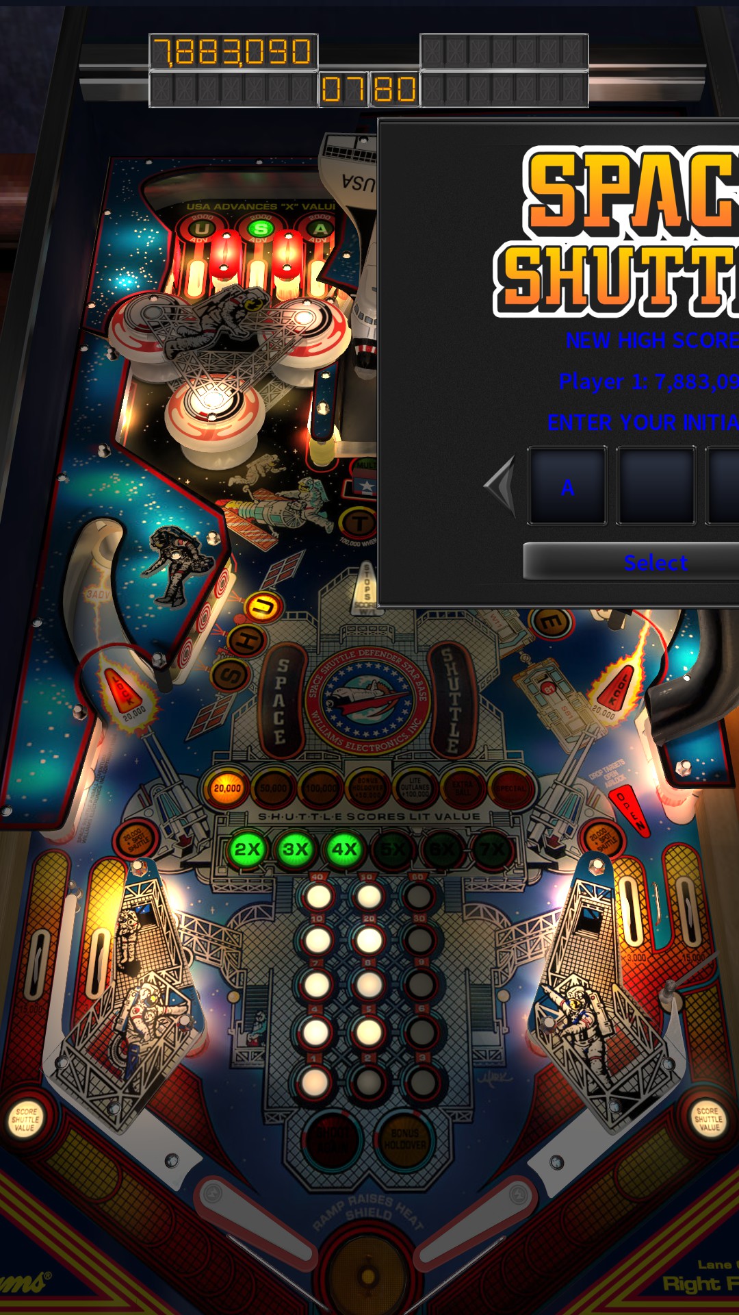
This thing is in beta, right?
Tbh, it looks more like an Alpha. Too many non-working things to call it a Beta.
This thing is in beta, right?
It's hard to read the table names. Why are the icons spheres on top of squares? Pick one. Pinball FX menus CRUSH the Pinball Arcade ones. It looks like a programmer is doing the artwork for PA. Hire a designer.
I don't normally have a mouse on my machine, so I can't even use the new UI.
The Flyers still look horrible
Here's an option I'd love...in the controller settings, letting us set up the sensitivity of the tilt when using the analogue stick. I don't mean the actual game tilt settings, but the zones on my controller. That way if I want to be able to take the stick right to the edge without it causing a hard slam, I could. Or I could make it so I only barely have to touch the stick to make it have a solid nudge.
This is should be possible 3rd party (x360ce, thumb stick tab), and first party if you buy the elite xbox controller (analog stick profiles). People have been asking for softer nudging and other features for years so I doubt they'll get to any recent feature requests anytime soon.
Agreed. "Dating" is stupid, and whether or not either of these UIs are "ugly" depends entirely on what year it is and not at all on the actual merits of either design. If something really hasn't aged well, it probably wasn't very good to begin with.What does it matter if it's dated or not? I'd love for the UI to be dated about 1738, myself.
Well, the first edition was released in 1999. The one in TPA is supposed to be the third edition, which IPDB has never found a year for (other places agree that it's 2003). I think being able to switch between the editions for games like this would be an interesting Pro feature.Also, Harley says 2004 on the interface, 1999 in the table history, and shouldn't it be 2003?
Um.. wut? The new UI is all about sorting. It's pretty much the main feature.I think there should be some sorting options for the tables; sort by date of table, sort by data of TPA release, things like that.
Um.. wut? The new UI is all about sorting. It's pretty much the main feature.
keyboard shortcut is page up/down, right stick for controller input-Table Exploration should also do the backbox.
keyboard shortcut is page up/down, right stick for controller input